A new navigation to increase applications
TASIS England
UX design / User research / User testing / Sitemap creation
kick off-workshop. 1 user behaviour audit. 27 recommendations. 176 insights. 11 bugs discovered. 10 customer interviews. 10 usability tests. 1 research report. 5 suggested sitemaps. 2 tree tests. 2 reports. 12 recommendations. 200 tree test participants. 1 finalised sitemap.
Supporting an award winning independent school to improve user journeys
TASIS England is an award-winning independent school that boasts a global community of students and families, and is a popular choice for many families who are relocating to the UKor looking for top education and boarding for their children.
Hancock & Rowe went on a journey with TASIS England to understand what prospective applicants and their families needed from an independent school website in order to simplify their research and decision-making processes.
The current website, which has grown organically since its initial launch, is making life difficult for TASIS England to properly present themselves in a way that communicates the unique nature of the school - something they are keen to communicate to their audience during the discovery stage of their journey.
To date, there has been a disconnect between how their site operates and the information preferences of their audience. In short, TASIS required a revised site navigation, based on their users’ needs, in order to generate and nurture more leads.
UX audit with real-time users to discover website behaviour and issues
The first stages of our work with TASIS England involved an initial piece of research: a user experience audit.
By using Hotjar we were able to review the behaviours of the TASIS England website users. This included observing recorded sessions on key user journeys and analysing heatmaps (scroll, mouse movement and clicks).
Micro surveys were also completed over a 4 week period to gather additional qualitative data around the users’ visits, and to engage potential user interview participants with an email registration request.
We were then able to review the data collected and put together our research report - this delivered 27 actionable recommendations where improvements could be made, 176 insights into user behaviour and 11 bugs that were impacting user experience.
“Partnering with Hancock & Rowe has transformed how we approach our website navigation, making it easier for families to find information quickly and effortlessly. Their user-first research and strategic insights give us confidence that we'll not only increase applications but also reduce support inquiries, freeing up our team to focus on what matters most.”
Christina Adampoulou, Head of Marketing and Communications, TASIS England
User journeys designed using research data
To further our understanding of the TASIS England audience and ascertain their requirements when accessing an independent school website, we carried out user interviews with parents of recent applicants as well as education and relocation agents.
These interviews provided important insights into the users’ needs, which in turn informed our recommendations regarding how the website should be restructured in order to improve the way - and speed at which - users discover information. By updating the foundation of the website (sitemap and navigation) we were able to simplify user journeys and reduce bloated, unnecessary content.
Testing website navigation labels and language
Whilst research forms the recommendations we make, we also rely on comprehensive testing to verify them.
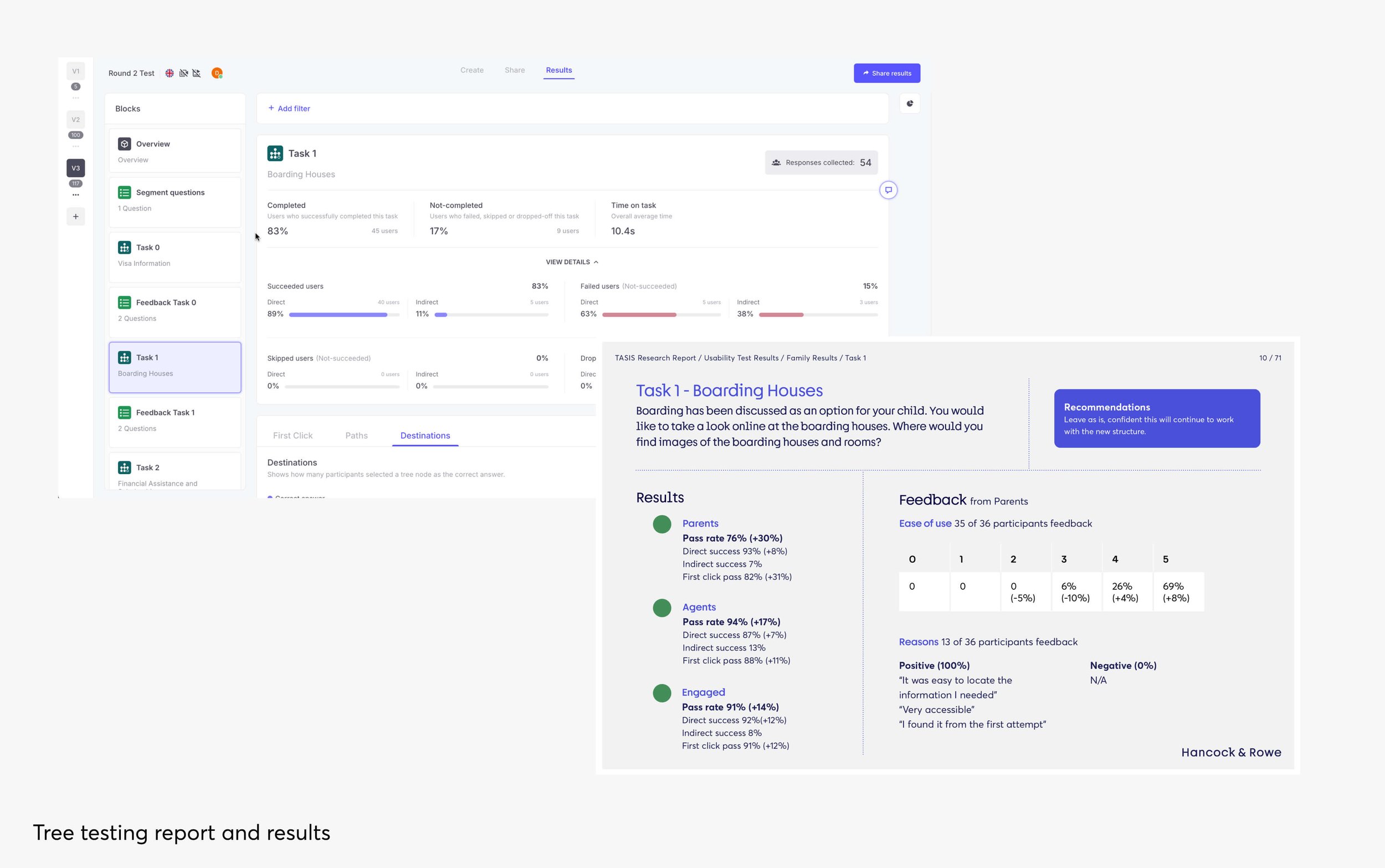
Our next phase was to carry out 2 tree tests with just over 200 participants. By using a test group of this size, we were able to ensure the language of the new sitemap and navigation reflected the understanding parents had of the education system and application process.
Running 2 rounds of tests meant we were able to make recommendations and improvements to areas of the navigation which failed to pass initial testing. This process resulted in a navigation which had a pass rate across 5 out of 6 user tasks, with the failed task identifying a need for a design and content solution to help users navigate between two sections of the website.
More work
-

A world first for corporate global travel
mysa | Booking Platform
-

Reducing partner onboarding from 3 weeks to just 20 minutes
Trouva | On-boarding process
-

Transforming a leading architecture firm
Poynton Bradbury Wynter Cole | Website and Brand


