A service desk designed for managers
iomart
UX design / UI design / User research / User testing / Prototype / Service desk dashboard
kick off-workshop. 5 user interviews. 10 usability tests. 1 research report. 1 new sitemap. 5 card sorts. 10 wireframes. 3 design routes. 32 page designs. 26 components designed. 1 prototype.
Supporting a technology specialist with user-centred design
iomart is a technology specialist that provides cloud infrastructure to their customers, from onboarding to technology support, they provide expertise, customer care, reporting and documentation as a managed solution to wrap around their customers’ applications.
They came to us with a service desk and ticketing system that had seen an increase in request categories and bespoke forms, which resulted in confused and frustrated users
By undertaking in-depth user research – a combination of interviews and usability testing – we were able to get to the root cause of their frustrations and identify areas that were in need of some refinement.
Service desk design, based on research
Through in-depth interviews with key users of the iomart platform, we gained valuable insights into their pain points and preferences. By testing the most common user journeys, we identified areas for improvement and optimisation. Our research revealed that their customers used the ticketing system as a project management tool, rather than a traditional service desk.
A newly simplified ticket journey
To streamline the ticketing process, we combined and reorganised categories - reducing confusion and making it easier for users to navigate. By minimising clicks and back and forth interactions, we created a single-screen experience to boost efficiency. Educational statements were strategically integrated to guide users in submitting correct ticket requests, reducing errors and improving overall satisfaction. We also reduced the number of forms needed per category and introduced a new search option to filter request options, further enhancing usability.
Reporting added to help managers prioritise
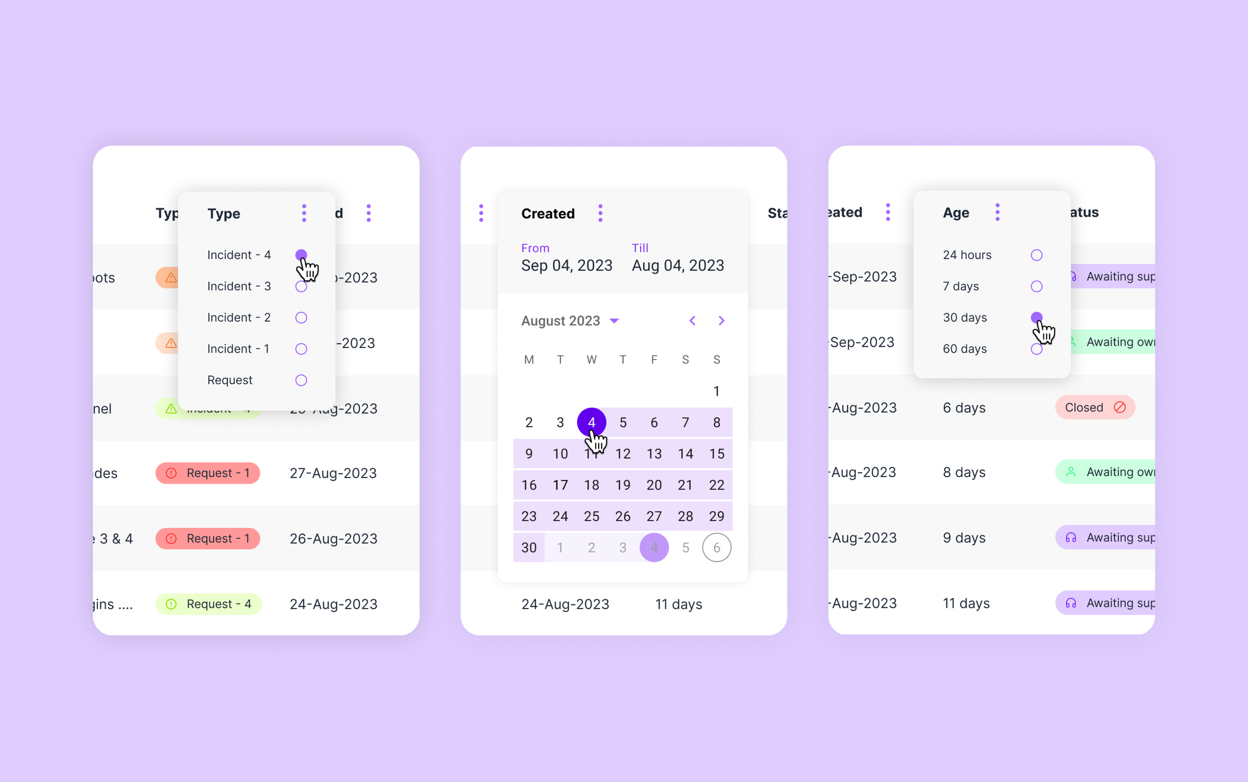
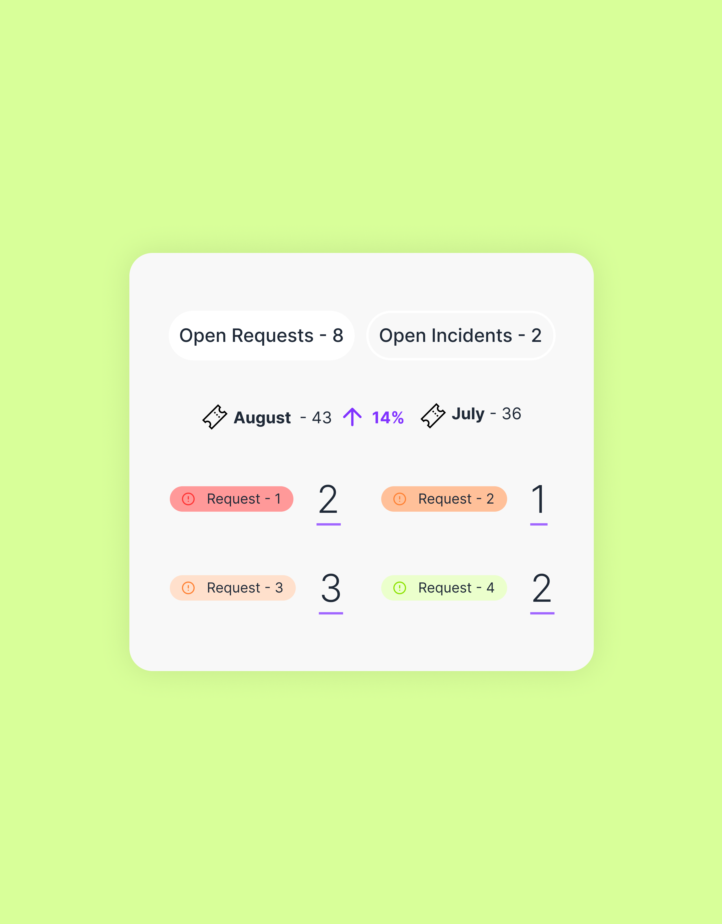
We implemented a simple reporting feature to assist managers in prioritising tasks effectively. The addition of open ticket reporting provides managers with a clear understanding of open tickets and their statuses. Quick filtering options within the reporting overview now enables managers to swiftly delve into critical issues and allocate tasks according to urgency.
Ticket status communicated visually in table view
To improve visibility and comprehension, we introduced a new colour system to visually represent the severity and status of tickets within the table view. This intuitive visual cue allows users to grasp the urgency and progress of tickets at a glance, facilitating quicker decision making and response times.
“Working with Hancock & Rowe allowed us to better understand the role our service desk has in the lives of our customers. We have been able to realign its role and functions to better support our customers and make their lives easier. A no-brainer for service desk design. Hancock & Rowe were able to deliver insightful research they then utilised to improve our user journeys and design a new interface to compliment them.”
Sharon Mars Leach, Chief Experience Officer, iomart
More work
-

A world first for corporate global travel
mysa | Booking Platform
-

Reducing partner onboarding from 3 weeks to just 20 minutes
Trouva | On-boarding process
-

Transforming a leading architecture firm
Poynton Bradbury Wynter Cole | Website and Brand


