Helping GP practices easily find content
Cambs LMC
UX design / UI design / Collaboration with TwoTen Studio
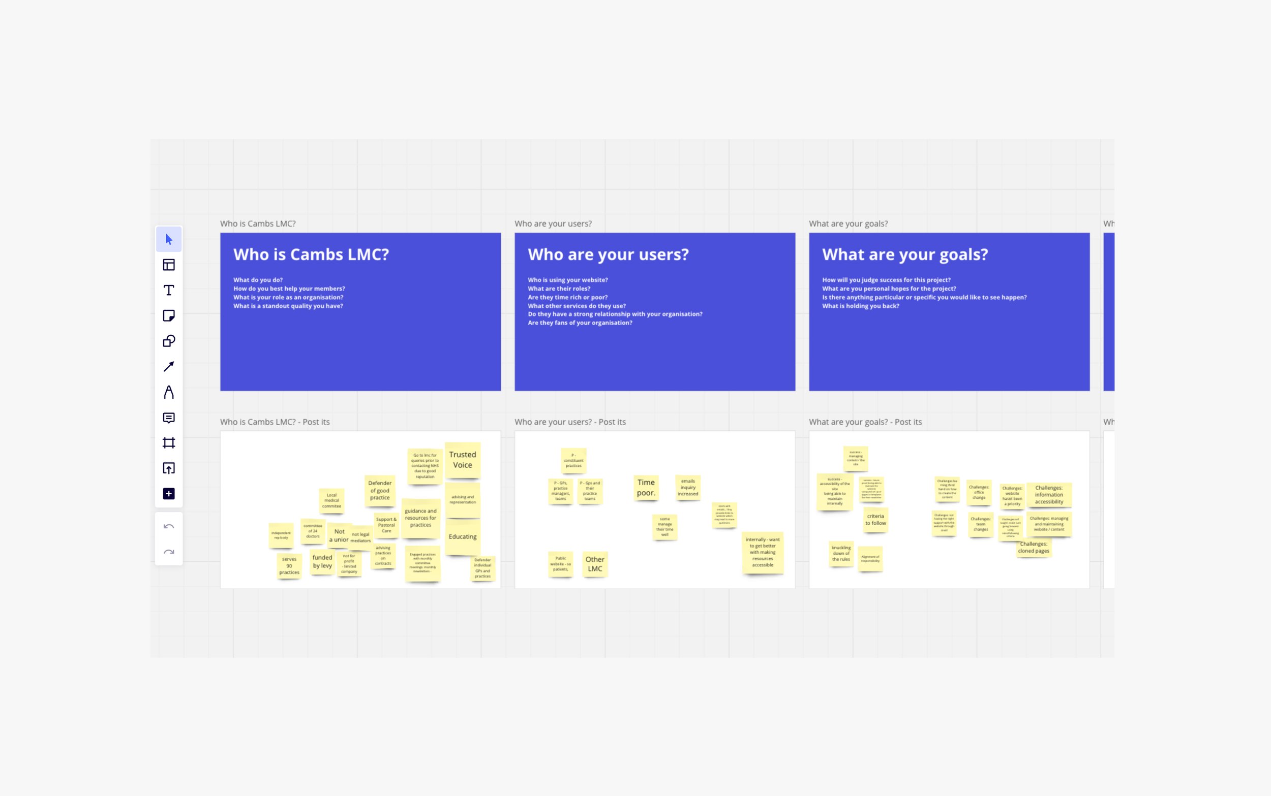
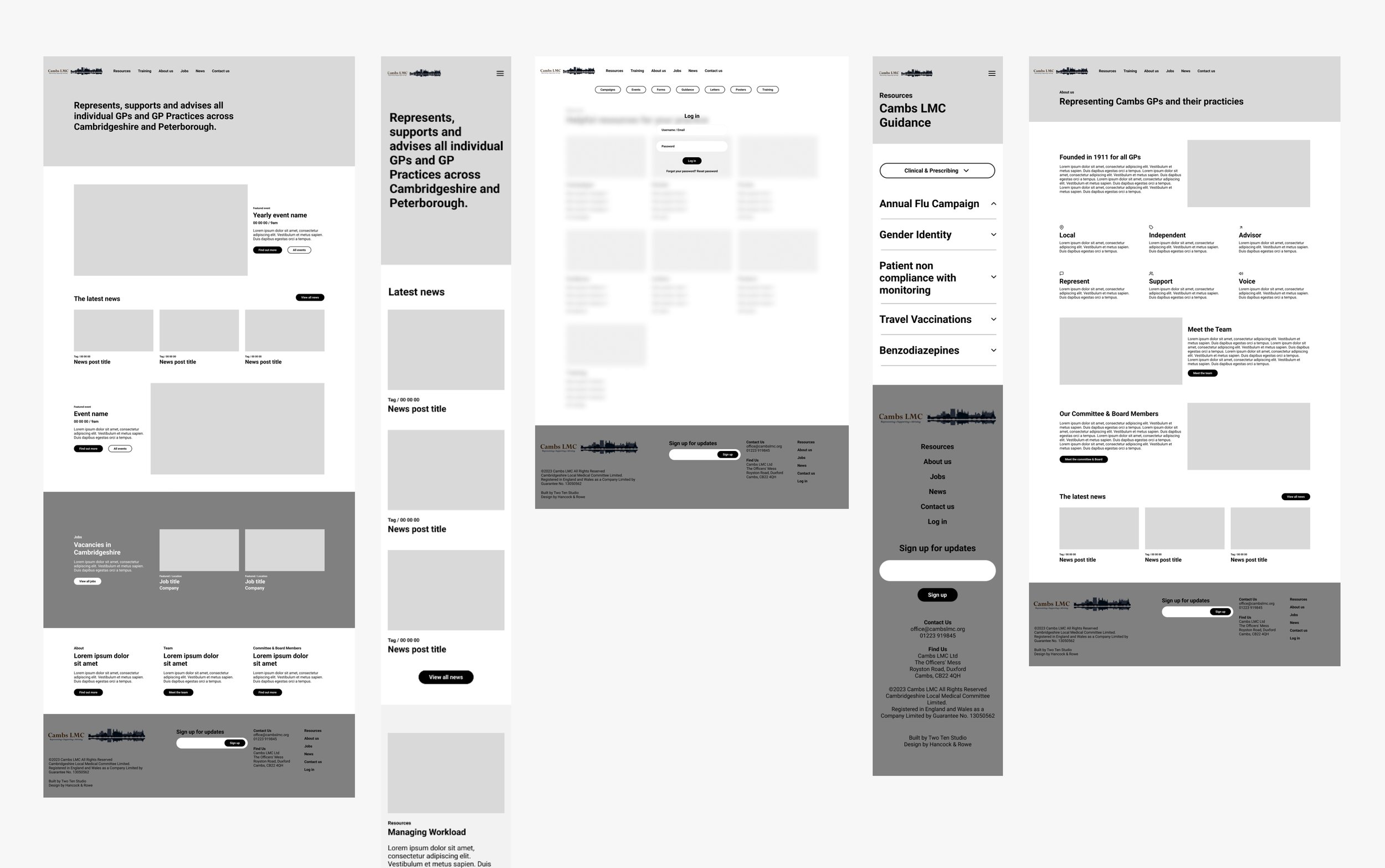
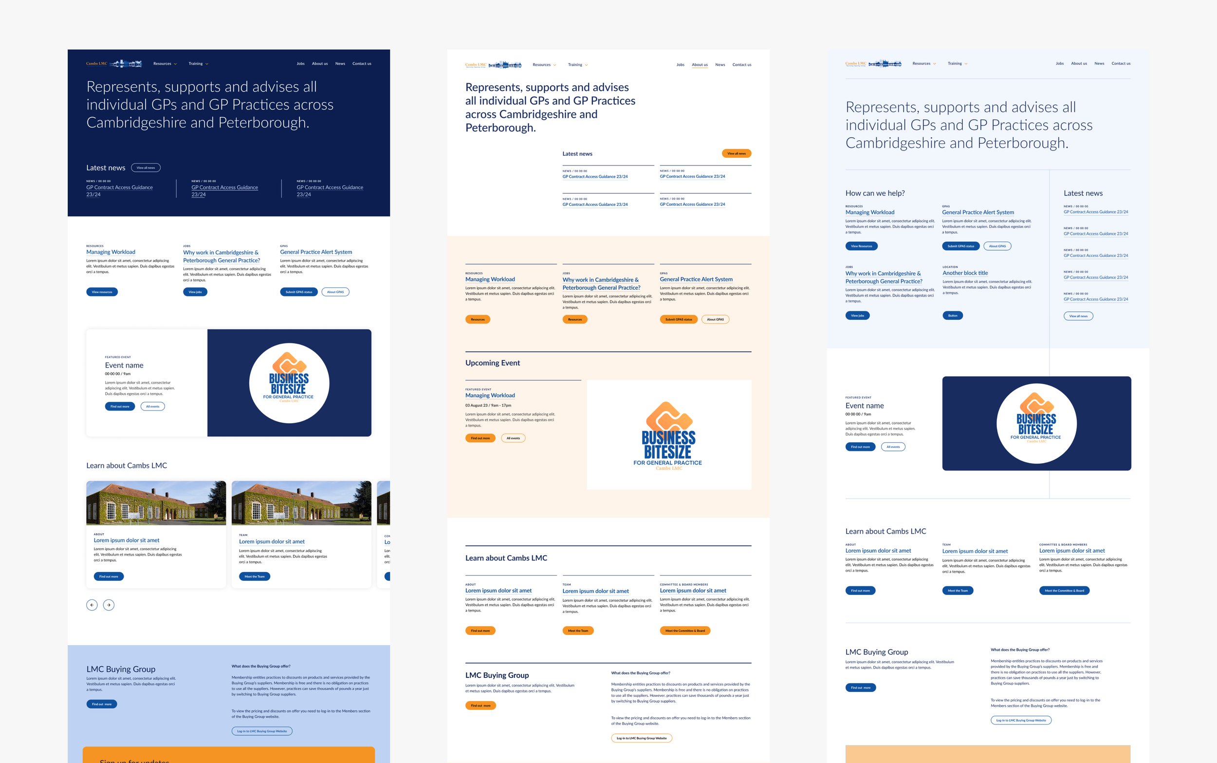
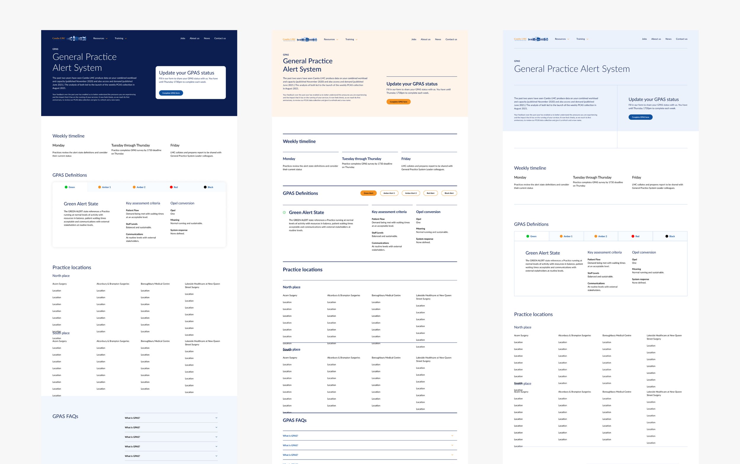
kick off-workshop. 1 new sitemap. 64 wireframes. 3 design routes. 62 page designs. 29 components designed. 2 prototypes.
Liberated the team at Cambs LMC from unnecessary administrative tasks through improved UX
The primary goal of our user experience design project for the Cambs LMC website was to liberate the team from the burden of frequent phone calls and emails regarding content retrieval. Our aim was to empower them to allocate more time and resources to create additional value for their constituents. By reducing the friction associated with finding information on the website, we sought to enhance the overall efficiency of the organisation and improve user satisfaction.
Designing with members needs at the centre of decisions
At the core of our design strategy was a commitment to a user-centred approach. Every design decision, from crafting a new sitemap to refining the user interface (UI) design, was meticulously considered with the needs and preferences of the website's users in mind.
"Hancock & Rowe have been integral in creating our new website that supports our constituent GP practices on a day-to-day basis. Their approach to simplified user experience, user journeys and user interface design has meant we can confidently organise and upload content that can be found with ease."
Emma Drew, Executive Officer Lead in Contracts, Regulations & Practice Liaison, Cambs LMC
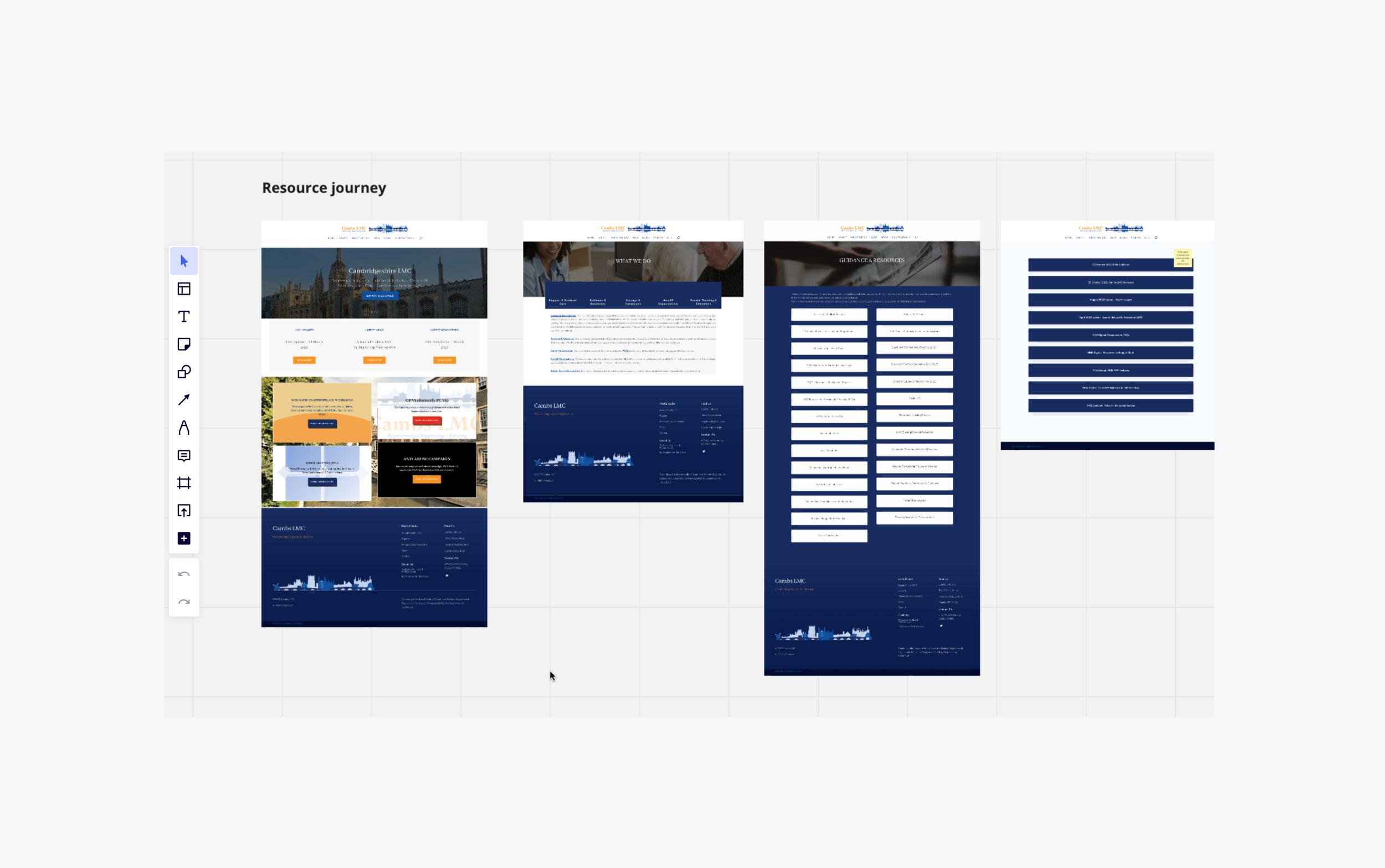
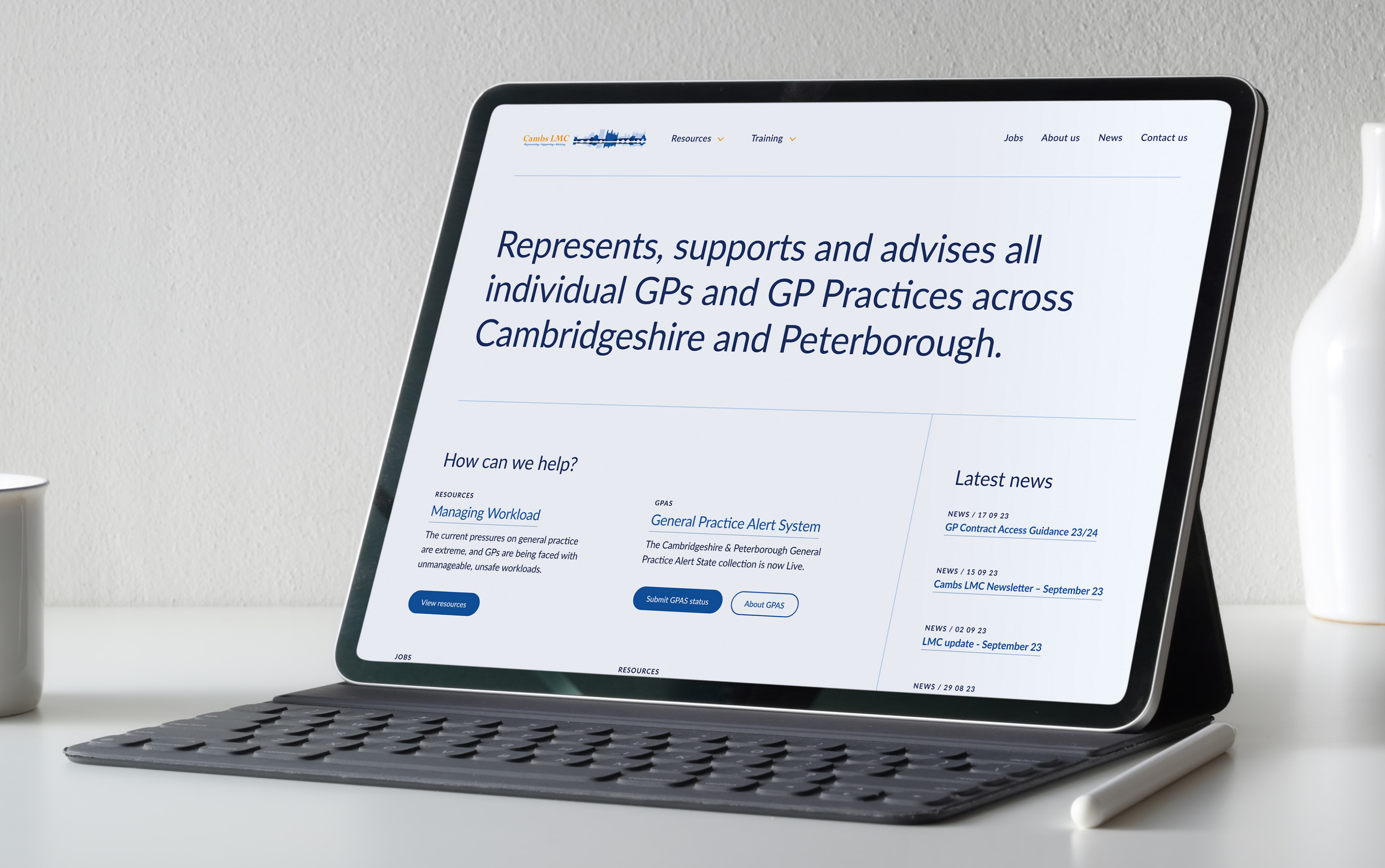
Simplified sitemap and scannable UI for content discovery
To expedite content discovery, we implemented a streamlined sitemap that reorganised and categorised information logically, making it quicker to find. The synergy between the simplified sitemap and a clean, scannable UI design played a crucial role in enhancing the user experience. Users can now navigate the website effortlessly, with content presented in an easily digestible format, allowing them to locate relevant information promptly.
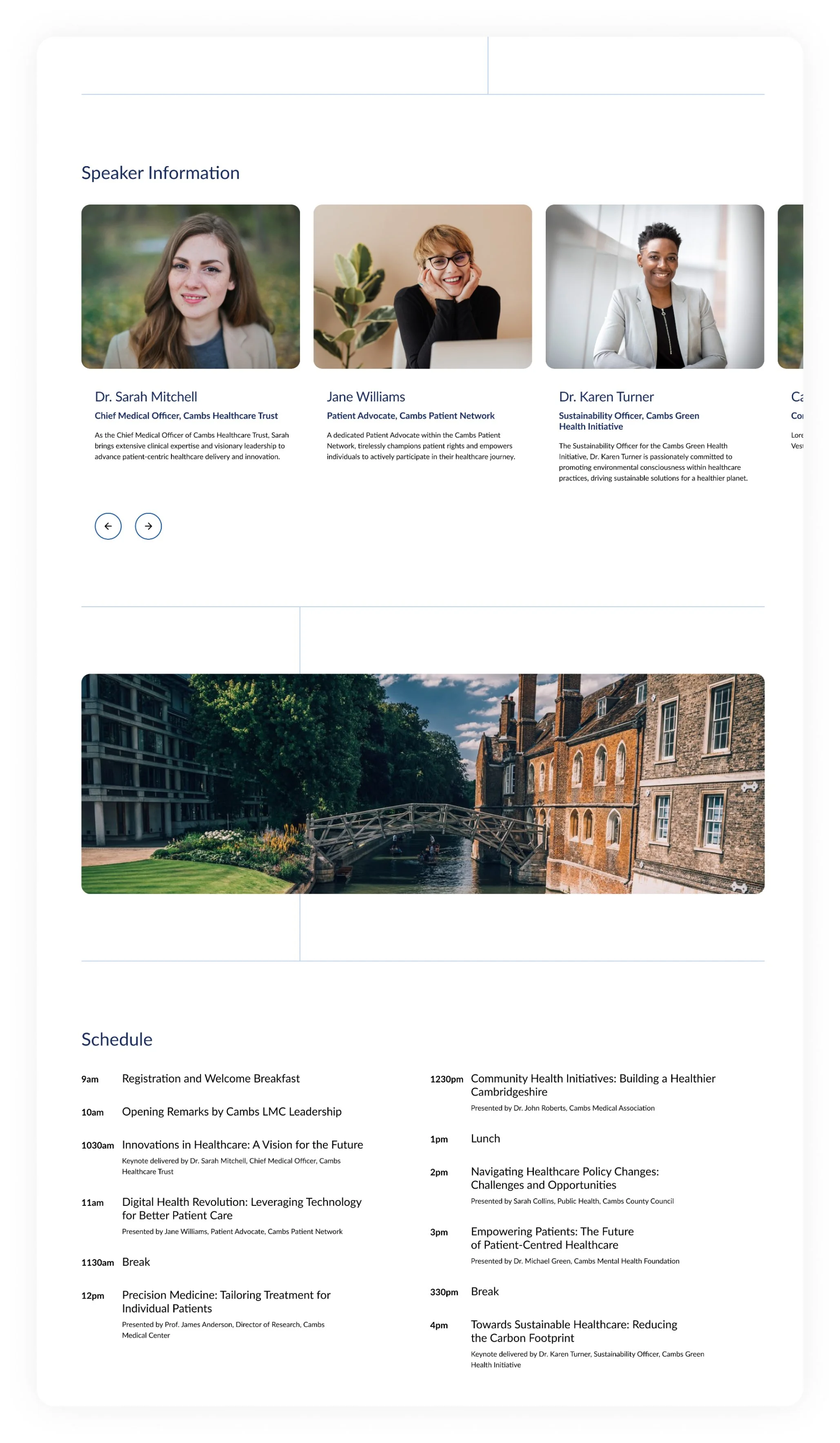
Exclusive member content merged into a single web experience
We strategically incorporated exclusive content directly into the website's sitemap to maintain a consistent user experience and eliminate the need for a separate platform. This approach not only ensures that users can access all relevant information from a single, user-friendly interface but also simplifies their navigation journey, making it more efficient and intuitive. By seamlessly integrating exclusive content into the existing structure, we've enhanced the website's usability, providing a cohesive and convenient experience for all users.
Another successful collaboration around everyone’s expertise
Our success in achieving a user-centred design was greatly facilitated by close collaboration with the experts at Cambs LMC. We worked closely with the team to gain a deep understanding of their content and the various use cases associated with it. This collaborative approach ensured that our design decisions were not only user-centric but also aligned seamlessly with the specific needs and goals of Cambs LMC, resulting in a tailored and highly effective solution.
More work
-

Reducing partner onboarding from 3 weeks to just 20 minutes
Trouva | On-boarding process
-

Transforming a leading architecture firm
Poynton Bradbury Wynter Cole | Website and Brand
-

Demonstrating the impact of teacher training methods
HOW2 | Website
