Demonstrating the impact of teacher training methods
HOW2
UX design / UI design / Craft CMS
4 weeks of discovery. 3 customers interviewed. 1 customer survey created. 4 heat maps reviewed. 9 insights obtained. 1 research report. 1 sitemap created. 32 wireframes created. 32 web designs for mobile and desktop. 3 pages revised post launch.
Increasing awareness and conversion
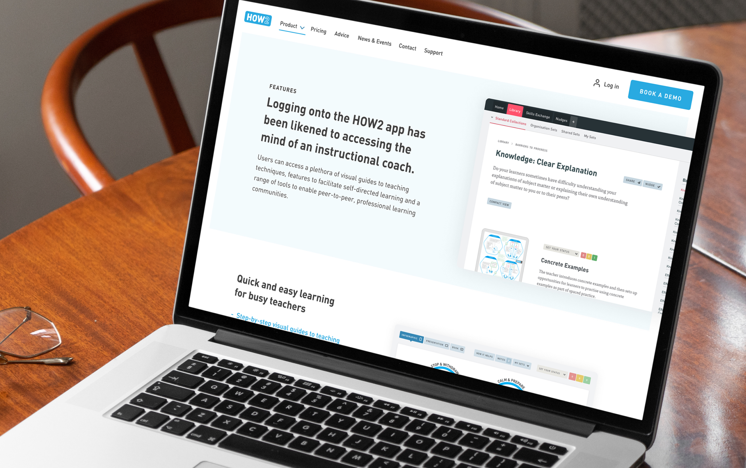
The HOW2 web app is a collaborative learning platform that makes it easy for teachers to apply evidence-based teaching techniques. Their primary tool is a library of over 160 visual guides and features that foster collaboration amongst peers. However, they struggled to communicate their core offer in a succinct way. HOW2 needed to hero their core products and tools on their site to increase conversion. Challenge accepted.
Utilising HOW2’s three new pillars of ‘why’ to structure the platforms features
HOW2’s offering is complex. By linking the platforms features to their newly created ‘why’ messaging and strategy, meant we could significantly reduce content on the homepage and scroll for the features page, reinforcing their core offering and getting customers to the information they needed quicker.
"Hancock and Rowe wrapped their heads around our app very quickly and offered both business and design-based expertise to develop creative and impactful solutions - every step of the way. Working with Hancock and Rowe could not have been easier.”
Ian Harris, CEO, HOW2
Granular information, for those who need it
Content is key, however, HOW2’s users needed a quick but informative read without being overwhelmed. With a clever new template, we reduced the scroll height by 200% on a number of core pages, whilst still offering more information when required.
Combining human and technological features
An on-going, honest relationship with HOW2 meant we have added value and optimised their site over the course of a year. After their new site went live we found opportunities to increase their conversion rates through ongoing analysis.
We identified a need to highlight the human aspect of the relationship between the product and its users. This has been achieved by including imagery across the site to show people interacting with the HOW2 platform. We also introduced real life success stories in the testimonials section of the website.
Integrating simple solutions to make a big impact
Rather than potential customers filling in a lengthy contact form to enquire, we gave them the option to book a demo at a time that suits them and the HOW2 team. A simple off the shelf Calendly integration saved a large amount of design, development and management hours to provide a budget friendly and effective solution.
More work
-

New websites for a growing homecare franchise
GoodOaks Homecare | Website
-

Reducing partner onboarding from 3 weeks to just 20 minutes
Trouva | On-boarding process
-

The best technology for the job
Motherboard | Ecommerce Platform


